Basics of css grid (2)

Posted on: 13-2-2024
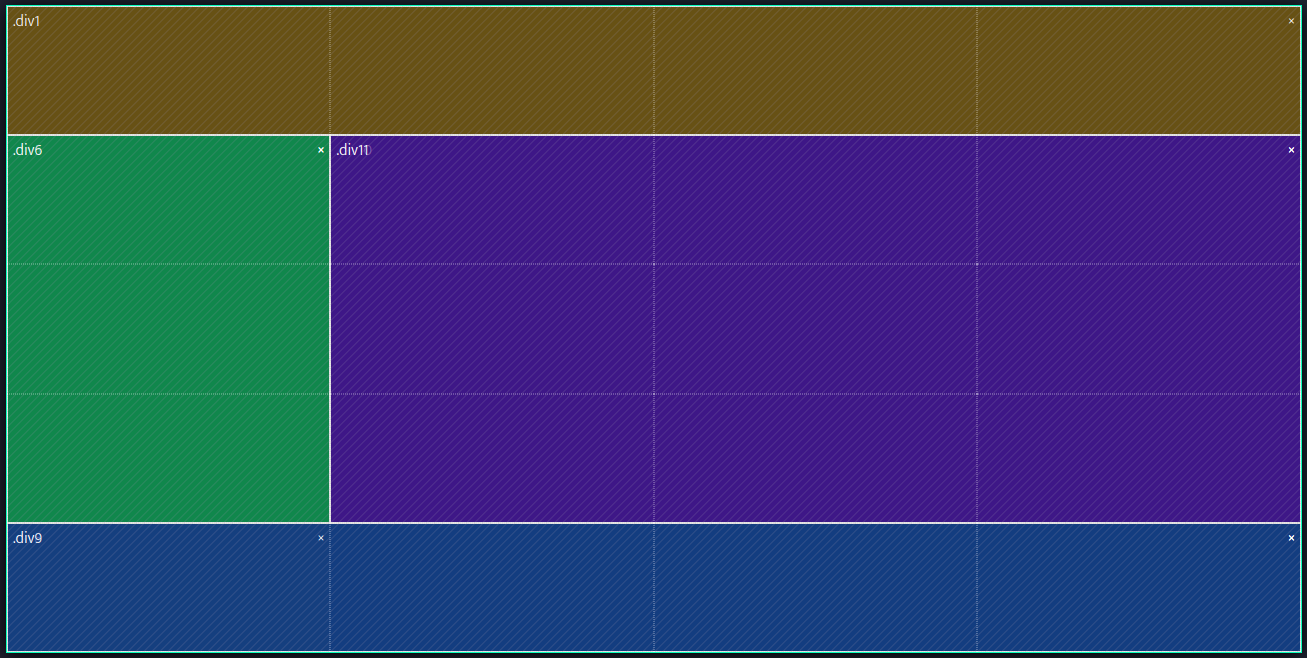
Our goal
We want to create a simple page layout using css grid that looks like the image below.
Grid area templates
This is a great use case for grid-template-areas. Using this property you can create areas within a grid and give them names which you can later reference.
So that is exactly what we are going to do.
In the picture there are four different colours denoting four different areas. So let's use grid-template-areas to create four areas.
display: grid;
grid-template-areas:
    "header header header header"
    "aside main main main"
    "footer footer footer footer";
Now we have created different named areas, let's reference them and assign them to an html element.
.my-header {
    grid-area: header;
}
We assigned the html element with a class of "my-header" to live in the grid area named "header".
Do the same for the other elements.
You can also set the size of a grid area using grid-template-rows and grid-template-columns
We can for example give our header (first row) and footer (third row) a size of 1 fraction and our main + aside (second row) a size of 4 fractions.
grid-template-rows: 1fr 4fr 1fr;End result
This is what the end result looks like.
HTML for "End result"
<div class="my-page-layout">
  <header class="my-header">
  </header>

  <aside class="my-aside">
  </aside>

  <main class="my-main">
  </main>

  <footer class="my-footer">
  </footer>
</div>
CSS for "End result"
.my-page-layout {
    min-height: 30vh;
    display: grid;
    grid-template-areas:
        "header header header header"
        "aside main main main"
        "footer footer footer footer";
    grid-template-rows: 1fr 4fr 1fr;
}

.my-header {
    background-color: orange;
    grid-area: header;
}

.my-aside {
    background-color: green;
    grid-area: aside;
}

.my-main {
    background-color: mediumpurple;
    grid-area: main;
}

.my-footer {
    background-color: dodgerblue;
    grid-area: footer;
}