Basics of css grid (1)

Posted on: 13-2-2024
Columns + rows
Let's try to create a complexer layout which is made easy using css-grid. Inspired by this challenge from frontendmentor.
Planning
Let's plan first and write code later.
This is what we are trying to create.
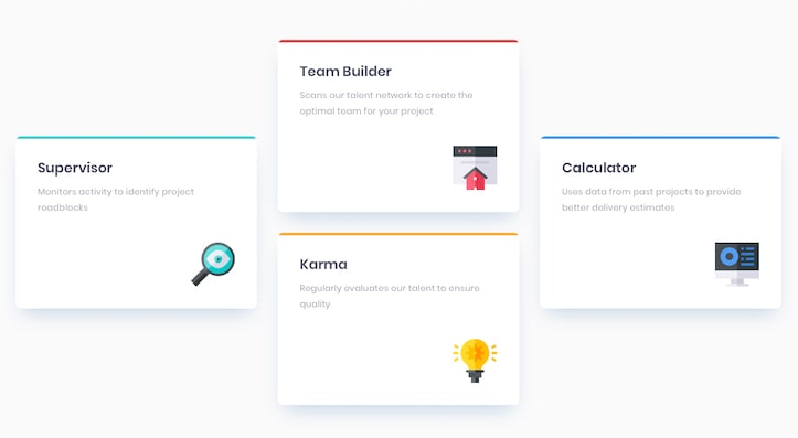
Try to imagine how this would look like on a grid. I see three columns and maybe three rows. Something like this.
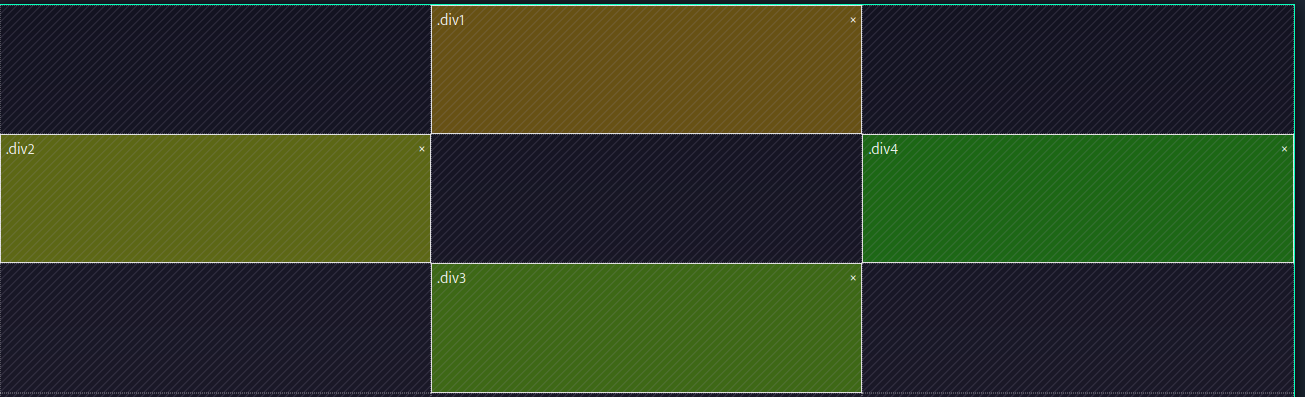
As you can see having three columns and three rows would do the trick. Now it is just a matter of telling our container that it should create a grid with those dimensions and telling its children where they should be placed on that grid.
We can use display: grid, grid-template-columns: repeat(3, 1fr) and grid-template-rows: repeat(3, 1fr) to tell our container that it should become a 3x3 grid.
We can use grid-column-start: 1, grid-row-start: 2 and grid-row-end: 3 to tell one of the children that it should be placed in the first column, on the second row. This results in the child to be placed on the left middle side.
You can do the same for the other children.
End result
This is what the end result looks like. Look at in on a bigger screen to see the result like in the picture.
HTML for "End result"
<div class="my-container">
  <div class="my-card my-card-top">
    <h2>My Card Title 1</h2>
    <p>My description 1</p>
  </div>

  <div class="my-card my-card-left">
    <h2>My Card Title 2</h2>
    <p>My description 2</p>
  </div>

  <div class="my-card my-card-right">
    <h2>My Card Title 3</h2>
    <p>My description 3</p>
  </div>

  <div class="my-card my-card-bottom">
    <h2>My Card Title 4</h2>
    <p>My description 4</p>
  </div>
</div>
CSS for "End result"
.my-container {
    display: grid;
    gap: 1rem;
}

.my-card {
    background-color: #1B1A55;
    color: white;
    padding: 2rem;
    border-radius: 5px;
    max-width: 20rem;
}

@media (min-width: 40em) {
    .my-container {
        grid-template-columns: repeat(3, 1fr);
        grid-template-rows: repeat(3, 1fr);
    }

    .my-card-top {
        grid-column-start: 2;
        grid-row-start: 1;
        grid-row-end: 2;
    }

    .my-card-left {
        grid-column-start: 1;
        grid-row-start: 2;
        grid-row-end: 3;
    }

    .my-card-right {
        grid-column-start: 3;
        grid-row-start: 2;
        grid-row-end: 3;
    }

    .my-card-bottom {
        grid-column-start: 2;
        grid-row-start: 3;
        grid-row-end: 4;
    }
}
My Card Title 1
My description 1
My Card Title 2
My description 2
My Card Title 3
My description 3
My Card Title 4
My description 4